
It may appear that there isn’t much to this comic and you’d be absolutely right. They say you should start your car every so often so the battery doesn’t die. I usually go out at night and randomly fiddle through different radio stations to see what the world is up to. Before the pandemic, I used to commute to work every day; now I only really leave my apartment to turn on my car for a handful of minutes. Definitely not complaining about my gas bill though.
While “Start Yer Engines” is narratively straightforward, it was personally groundbreaking on a technical level. I took risks that paid off and pushed the boundaries of what I’m able to do digitally. The process of its creation lead to more than one revelatory moment and has shaped how I have planned every subsequent comic. Let’s dive in.
1) Art imitating life
I always used reference photos. I struggle to draw realistic spaces from imagination and portray depth and size accurately, but I can manage pretty well with an image to go off of. Since all my stories generally take place in one location (my apartment) and generally feature one character (moi), I can make it work. I bought a lightweight aluminum tripod to hold my phone and it has made setting up a shot and, when needed, getting into frame incredibly easier. No more makeshift stands out of books and boxes!
2) Doodling in boxes
Believe it or not, this is (nearly) everything I did by hand for this comic. This is the untouched image straight from my scanner. You’ll notice there are often duplicates of the same sketch, e.g. the speech bubbles. I had imported the initial sketch into GIMP and found that they needed resizing, reshaping, or otherwise needed redoing. I drew a second version without bothering to erase the first since it was all going to be cut out and rearranged anyway. So I had all my raw material. Time to mold.
3) Go forth and multiply
In “Adventures in Online Dating I”, five of the nine panels take place in a kitchen with the exact same framing. Having to redraw the exact same background five times was tedious and frustrating, but only now I know that it was needlessly so. I digitally copied the first panel to occupy all six frames of the comic. I could not even fathom how irritable I would have been after having drawn the same panel six times in a row. The inconsistencies between the sketches would drive me nuts. Luckily, that outcome was avoided. In its place, a simple exercise of our reliable friend copy and paste. This was an eye-opening moment. Before, I may have been too wary to commit lots of detail in an illustration because I would have to do it over and over. Now, I can perfect a single backdrop and retain its quality across the entire comic. Knowing I had this tool at my disposal has opened more creative possibilities for me going forward.


4) In the pocket
This was the bulk of the work. A good chunk of the time I saved from duplicating the backgrounds was reclaimed by fitting the individual elements of each panel. This took some trial and error. Take the example above. The goal is to get Andrew sitting in the driver’s seat and turning the key. First, I had to cut out the part of the image that would be in front of and overlap the character (his relative foreground). This was done by hand, outlining the specific areas of the illustration that needed to be removed. Next, the character is pasted in. I usually had to rescan more than one sketch to get the figure to fit correctly. His head would be too big or his hand wouldn’t be in the correct position, etc. After the character is placed properly, the foreground objects are returned back on top and now you’ve got your image! In this process, three layers are created: 1) the background, 2) the character, 3) the foreground/pocket. Because they exist on separate layers, they can be adjusted after the fact, if needed. Now rinse and repeat!


5) Make it rain
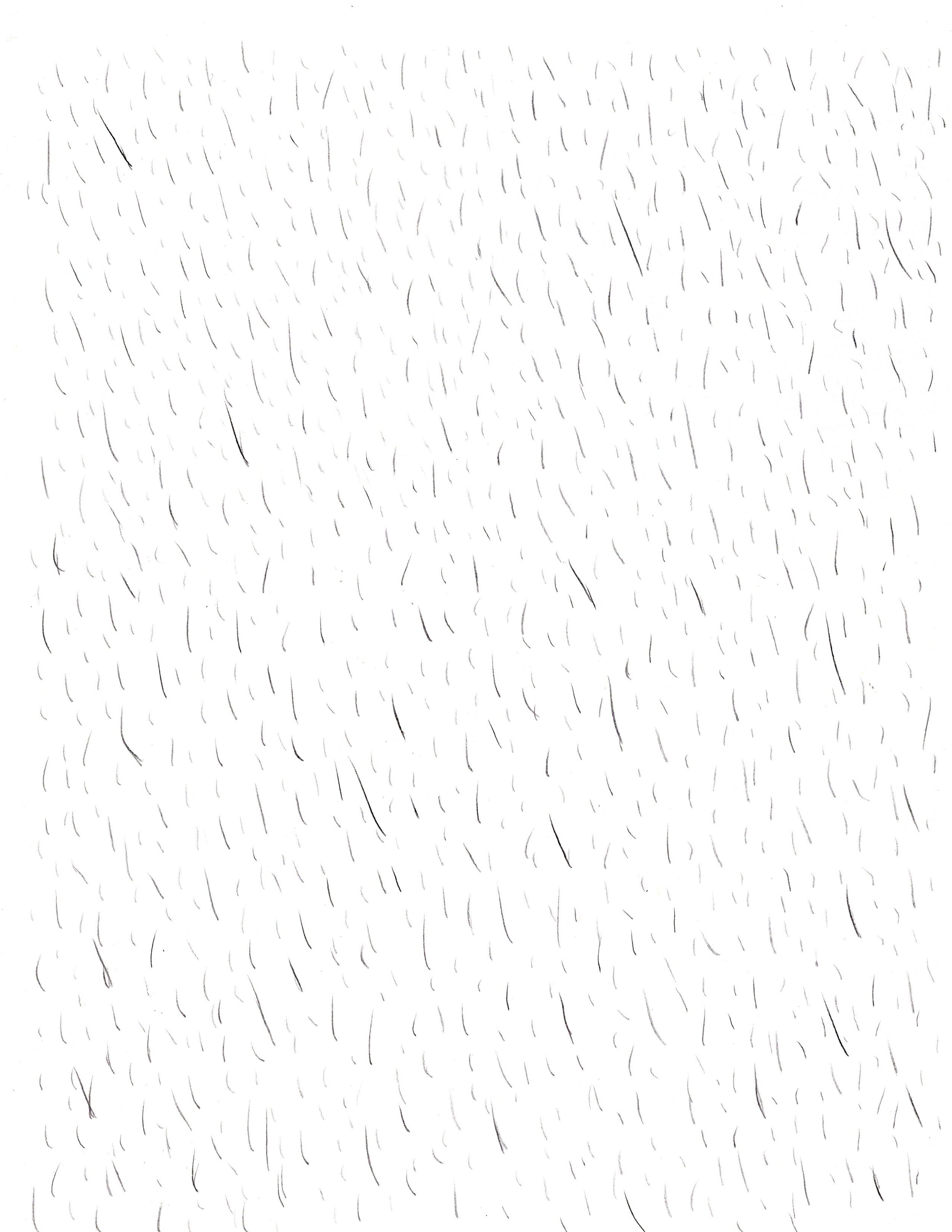
I could have drawn a single panel of rain and like the backgrounds, duplicated them over each panel. The method I used, however, produced a much more dynamic result. I completely covered a sheet of paper with “rain”, scanned it in, removed the whites, and was left with unique, non-repeating rain droplets that could cover the span of the comic. Placed on top, each panel now has its own rain as if I had drawn them individually. Again, the benefit of doing this digitally is that it’s nondestructive. The dozens and dozens of dark lines are not permanently etched into the illustration. I could go “under” the rain, make changes, then return the rain as if nothing happened. In other words, I can control the weather.
6) Last looks
This part is no fun, but it must be done. I want my comics to look handmade and “sketchy”, but not feel rushed or cheap. I polish and clean up the more egregious aberrations in the image, but I also try to retain a lot of the stray lines and inconsistencies. To me, it gives the illustration a lot more character and life than something with perfectly rectangular borders and complete uniformity. That’s why even though I duplicated the backgrounds, I did not duplicate the panel borders. I individually drew out each panel border then fit the background into each one. It adds an extra level of tangibility and makes it not as obviously digitally processed.
7) That’s a wrap
Anyway, that’s about it! Once all the content is locked, I apply the color grade and do a final contrast pass. I make sure everything is centered and lined up then its JPEG time. Again, the entire creation process for this comic was incredibly rewarding. It was a series of incremental goals and obstacles that required creative problem-solving and at times, brute trial and error. But I learned a lot. I’m going to look back fondly on this one.