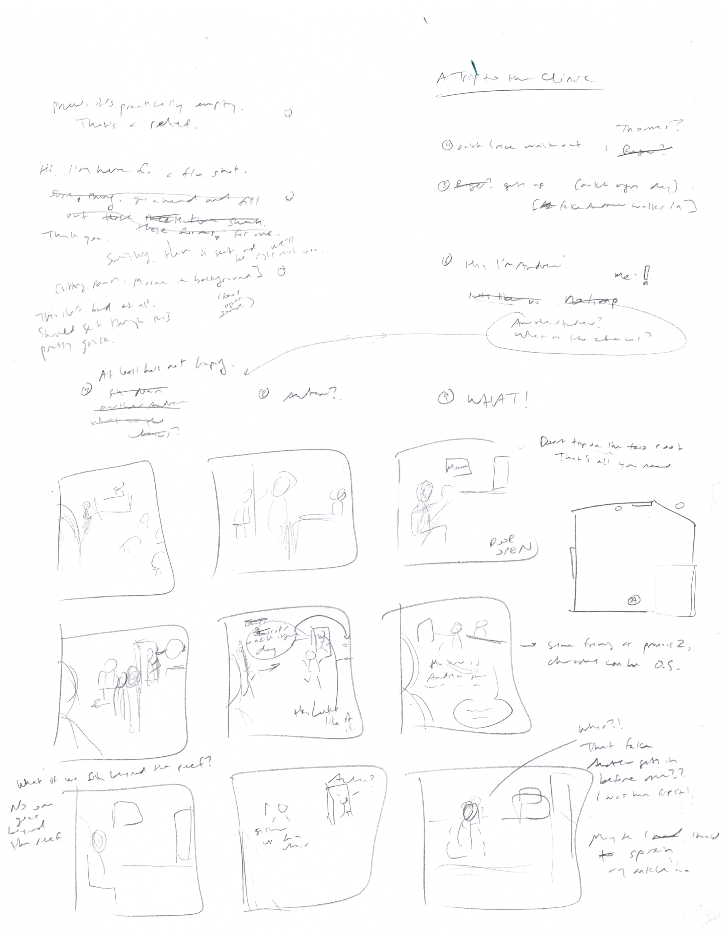
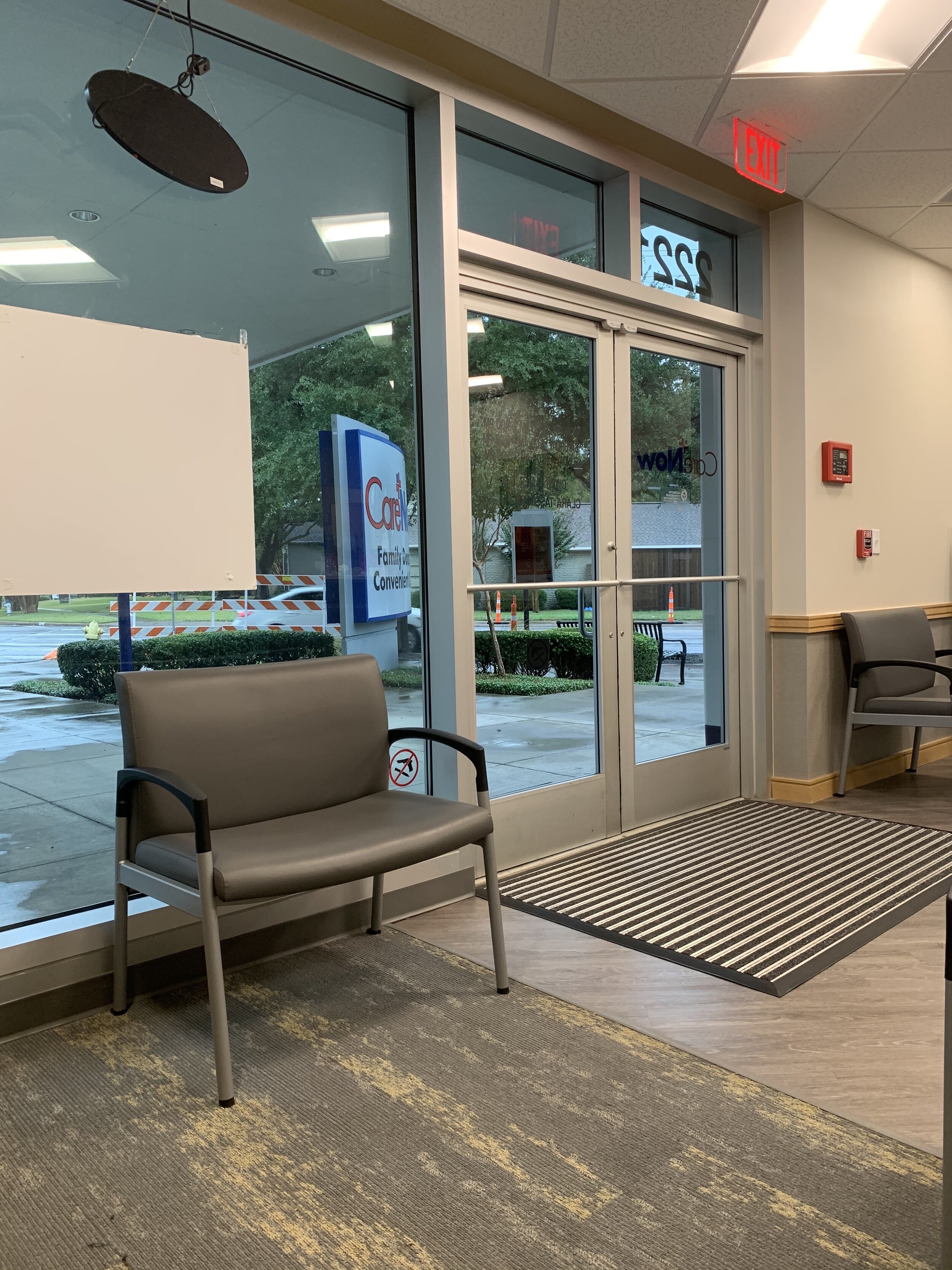
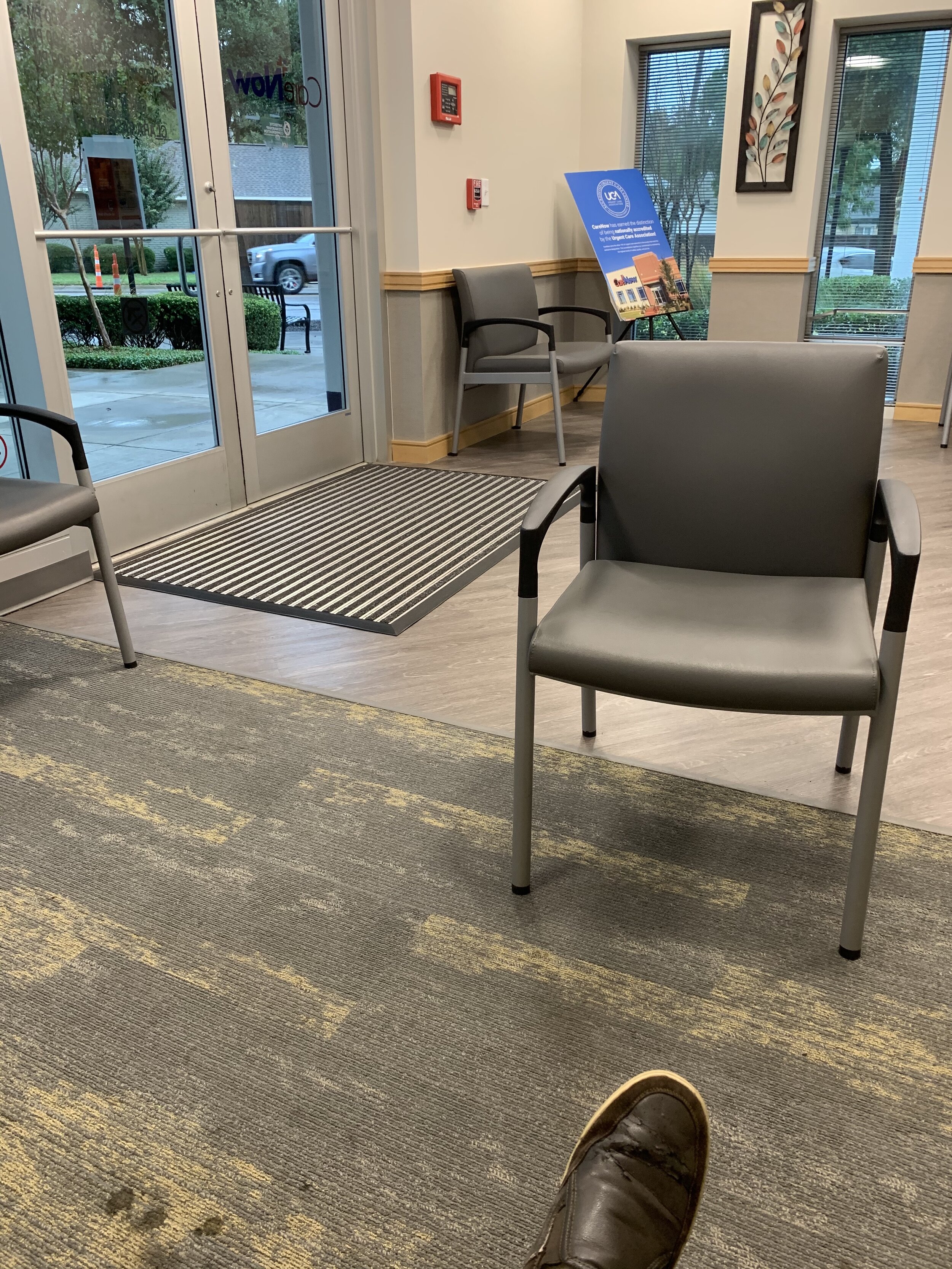
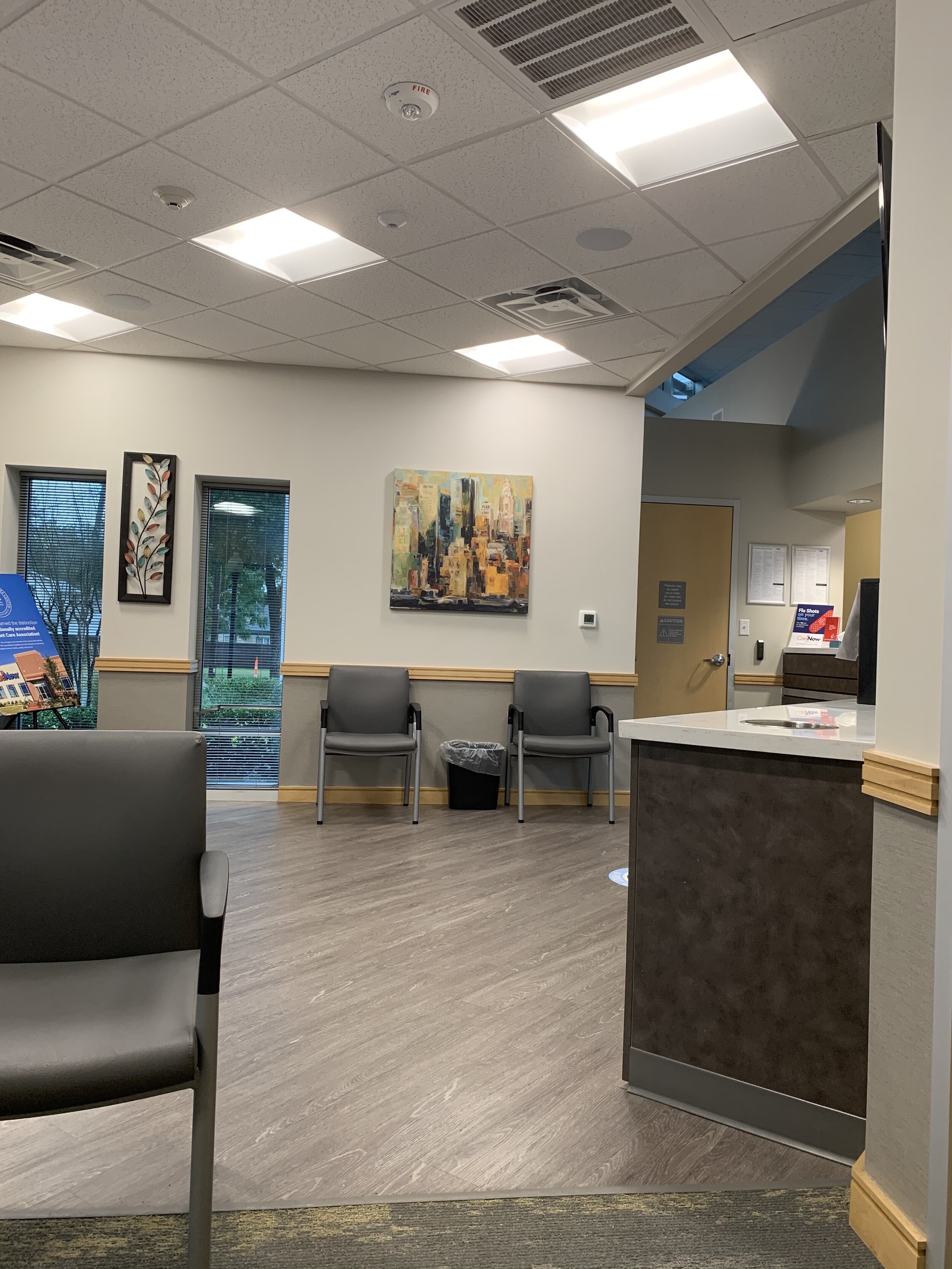
This was a tough one and I think it shows. This is the first D&A comic I made without using reference photos. For every other comic I’ve made up to this point, I’ve rigged my phone up on a tripod, staged myself in my apartment, and posed for the panel. For some comics, I’m working off of exactly nine individual photos of myself, one for each panel of the comic. If it’s not all about me (like the couple comics I’ve done about music), I’ll have stills from a YouTube video and album art at my disposal. While I did sneak a couple quick pics while in the clinic waiting area, I was obviously not able to position myself (and others) to the specifications of my sketches. I wasn’t even thinking about making a comic at the time! And I’m definitely not going back now to ask if I can take pictures of myself miming in place.

So what was the process? First, I simplified the space. The actual waiting area had a lot more corners and cut-outs, but I pared it down to a pentagon. I drew a top-down outline of the space, so I could have a better sense of where people were in relation to each other and how things would appear from my perspective. Next was the script, which I am just now realizing is very difficult to explain. I don’t ever write only the text first then fit it into a comic. I create the text and visuals in tandem because you must be conscious of how the story you ultimately want to tell will be affected (or enhanced) by how you adapt it to a specific medium. I could have written out my “trip to the clinic” and it could have been adapted into any number of forms: a short story, a poem, a short film, a song. But by forming the textual component at the same time as the visual (panel layout), you’re ensuring that the version of the story that eventually makes it on the page is best suited to be a comic.
Comics provide so many additional tools to enhance narrative flow and meaning beyond the face value words and pictures. Panel size, panel arrangement, panel spacing, panel repetition, panel variation, font, font size, speech bubbles… Sometimes action is just laid out in a way that serves to fit the text, but being able to take advantage of and unify all these technical aspects allows you to harness the true potential of the medium. It was a deliberate decision to have the second row of the comic all from the same perspective. Having the same framing across multiple panels in an unbroken row aids in creating the sense of time passing. It’s no mistake that panels 3 and 7 are the same framing (top right, bottom left). It creates a symmetry that anchors the whole comic and cordons off the three primary events that happen in the story (the arrival, the waiting, and the whining).
So I think the structure of the comic is sound, but visually, it lacks detail and realistic depth. That’s why reference photos are so helpful. I can clearly see the vanishing points in the space and make sure that my illustration follows it. And while I don’t trace every wrinkle I see on my shirt, having a photo guides the level of detail I include to make it believable. Both of these aspects were lost in this one. I had to conjure most of the visuals from my imagination, which is great for ordering and framing, but not for realism and detail. This comic was a real challenge, but I learned a lot. Good news though: won’t be needing another flu shot for a whole year, so I don’t have to worry about doing this one again. Oh yeah, being immunized is pretty cool, too.